OUR WORK


See What We've Been Up To
Our work speaks for itself
DYNAMIC SOLUTIONS FOR DYNAMIC BUSINESSES
Browse our various projects below and rest assured your marketing project is in good hands.
For website examples, click the image to view the live site in your current browser.
SEO & Google Ads not pictured below, although we're rockstars in those areas as well.
For website examples, click the image to view the live site in your current browser.
SEO & Google Ads not pictured below, although we're rockstars in those areas as well.
Logo –
Client: Lionsgate Design Collective
Award-winning interior designer Tina Singh from Lionsgate Design was launching a new arm of her design firm & needed a new logo based on her existing branding. Our logo design team kept things simple: We went with that timeless-classic
design Tina loves so much, with just a touch of modern.
Logo –
Client: Karen Sue-A-Quan Coaching
Karen Sue-A-Quon is soft-spoken, subtle and authentic. Tulips represent rebirth and rejuvenation, just like her coaching services, while the soft pink icon is a beautiful contrast to the mid-grey font. This logo truly represents her & her approach to life coaching.
Logo –
Client: Chelseys Cookie Co.
Professional Baker Chelsey wanted a logo that's feminine, cute, & eye-popping, yet conveyed that "homemade" feel that mirrors her homemade cookies. The Flowerpot logo team came up with this beauty and it's absolutely stunning!
Website – Client: Enspire Dental Opportunities
When Melissa Calway wanted to start her own business for the 1st time, she needed a web/marketing company she could count on and trust. We assured her we’d take great care of her and she’s been a Flowerpot client ever since.
View the full site:
Website –
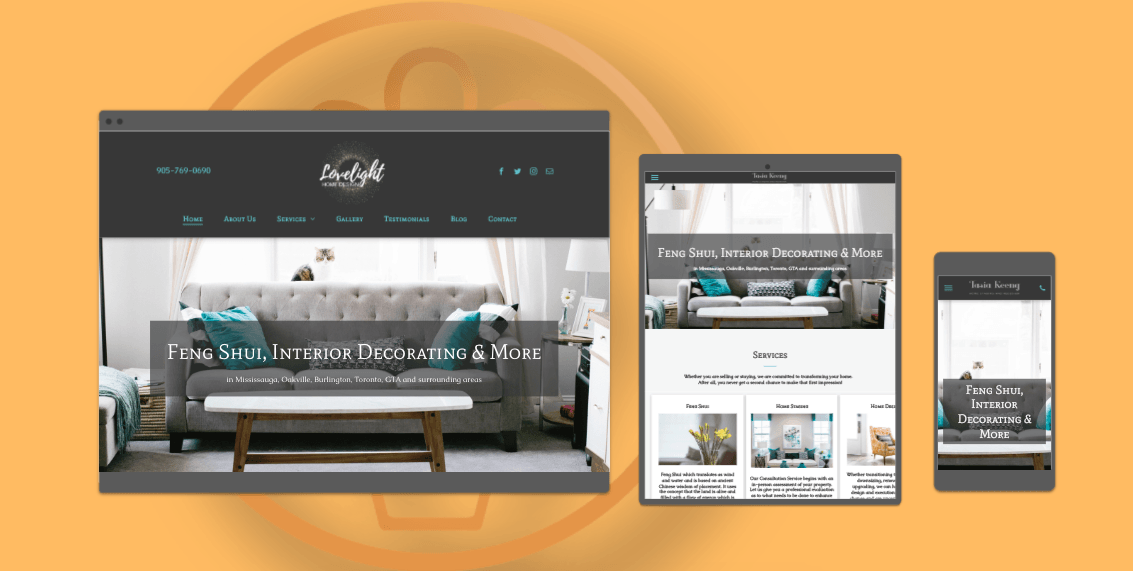
Client: Lovelight Home Design
When you’re a home-staging and Feng Shui genius like Tasia Keeng, at Lovelight Home Design, your website has
to reflect just how creative you can be. Our team created her a website that screams elegance & class.
View the full site:
Logo – Client: Stefania Elise Photography
Toronto photographer Stefania Elise envisioned a logo that evokes class and professionalism but also characterizes her passion for photography. The creative team at Flowerpot Marketing put their heads together to create this ultra clean and one-of-a-kind logo.
Logo – Client: Cruise Wedding Planners
We love traveling, and when Cruise Wedding Planners asked us to design their logo, we set sail with a simple & clean logo design that represents love, travel, romance and of course class & elegance. Elements of wedding rings combined with ocean waves is exactly what they envisioned for their brand. Did you notice the subtle cruise ship?
Logo –
Client: Matilda Nestoroska
Professional Realtor Matilda Nestoroska was sick and tired of design companies incorporating a 'house' into her logo. We heard her loud and clear.
Website – Client: Accelerated Release Technique
Capturing the beauty and essence of an energy healer and published author is not as easy as it appears. But this task was no match the creative team at Flowerpot Marketing!
View the full site:
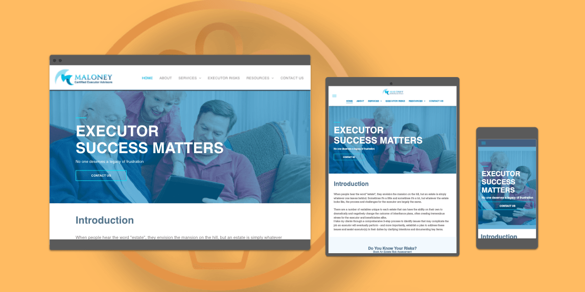
Logo – Client: Maloney Certified Executor Advisors
Warmth, trust, sincerity and modern are what come to mind when viewing Maloney Certified Executor Advisors' logo. This is very important when helping families plan for the loss of a loved one.
FILL OUT THE FORM BELOW & ONE OF OUR FRIENDLY AGENTS WILL GET BACK TO YOU!
Contact Us
Awwwww, we love getting love letters!
Thank you for contacting us.
We will get back to you as soon as possible
Oops, there was an error sending your message.
Please try again.
